Saturday, May 16, 2009

Cute Baby Clothes for Little Trekkies & Geeky Parents

Yes, I spend way too much time on Facebook! I recently noticed that a lot of my friends and I all had status messages about seeing the new Star Trek movie. It seemed that all at once the lot of us were congregating in movie theatres to feed our geeky imaginations. And, when I commented on a friend's status (as I'm way too apt to do), I discovered that she and her husband had attended several very geeky films while she was pregnant. It seems highly probable that she will have a Geeky Baby.

So all this made me focus my efforts on moving my designs to the new store. It's going to take me so long to move all my artwork to Zazzle, but I'm working at it bit by bit (pun intended). I thought it seemed logical to make my next focus the geeky/nerdy/techie designs. One of my very first drawings was of a Little Trekkie in diapers, so it feels good to see that in my new forum.

Here's a sampling of some of the adorable baby clothes and cute products for new parents that you'll find at my new store, Little Geeks. CLICK ON ANY PICTURE TO BUY NOW.

Little Trekkie Toddler T-Shirt shirt
Little Trekkie Toddler T-Shirt by littlegeeks
Many more tee shirt designs available on www.zazzle.com


Thursday, May 7, 2009

Cafe Press Doesn't Treat Designers Fairly

This blog is meant to be a place for me to share my experiences about being a business owner, but I've delayed writing about my experiences with Cafe Press, because I didn't want to post something on the internet that I'd regret later.

I'm not good at being succinct, but I will try. Cafe Press really let me down. Cafe Press does not value the designers. They switched to a mandatory maximum profit of 10% for the artists who actually create the designs. I strongly believe that I contribute far more than 10% to the finished products. For those of us who have already invested hundreds of hours, it's not easy to know what to do next. For any artists, designers, or stay home moms looking to start a new business, though - let me be very clear. YOU SHOULD NOT DO BUSINESS WITH CAFE PRESS. You deserve better.

I've started the long, involved process of switching to another Print On Demand company. Many Cafe Press designers switched to Zazzle, and I've been very impressed with everything I've seen of them so far. This whole experience has been very upsetting, so I thought it would make me happiest to focus on one small niche in my designs and to choose something that I am personally invested in . . . I chose to focus on my Unitarian Universalist designs. I've opened a gallery selling Unitarian Universalist gifts featuring my original artwork at Zazzle.

The process of uploading and organizing designs is very different, so I've got a steep learning curve. One of the designers at Zazzle, Praire Ghost, has been particularly helpful. She's given me lots of one on one tutoring, and I'd love to be able to create Personalized Greeting Cardslike hers. Feel free to click the previous link and have a look around her shop. She's been kind to me (a stranger) and I'd like to promote her gallery.

Because it takes a while just to get a design up at my store, I still have a very long way to go. But one day after I uploaded my Elements Chalice Design, I sold 10 UU chalice keychains! I haven't even done a Google Feed yet!

Here's a picture of the keychain with my design. Just click the picture to buy now . . .


One of the things I really like about Zazzle is that even though I've chosen a few products to display each design, customers have total control of which products they choose. Even if you don't see one of my drawings already on a particular product (for example, a framed poster) . . . you can just choose to have it printed on that product. And there is always the option of customizing a product by shrinking my drawing and typing in any text. At Zazzle, you can personalize in this way immediately (rather than waiting for me to do it) at no extra charge.

I have a long way to go, but I'm feeling cautiously optimistic.

Friday, April 17, 2009

A Job Well Done

I feel very proud of myself. This post is, simply put, a way for me to brag.

I started my online baby clothes store, Little Characters, almost a year ago. I'm not exactly rolling in dough, but 95% of the time, I've felt happy about it, and I would judge it to be a success. Today, I'm not just feeling happy - I'm ecstatic! If I was physically capable of doing cartwheels in the street, you would now see a chubby 30-something woman awkwardly tumbling around the cul-de-sacs of suburban Maryland.

I really love the design I just finished for 
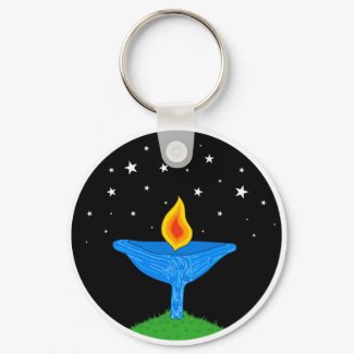
little Unitarian Universalists. You can find baby clothes for a baby UU in my new Unitarian Universalist store.


This design is an expression of what I believe to be my unique drawing style and something I care deeply about . . . Unitarian Universalist identity. My first UU design didn't feature any of my cartoony people. I drew religious symbols from many of the world's traditions and fit them inside the letters to spell UU. I am happy with this design, too. It represents not only the radical hospitality and respect for diversity among UUs, but also the potential value the world's religions have as a source of inspiration for UUs.

But as I wrote in my blog post about that design . . . it wasn't as much of an expression of a unique UU identity. One member of my congregation wrote that she had hoped to see a design centered on a chalice. Two things kept me from doing that right away. First, I had seen other chalice designs on CafePress that were good and I felt somewhat intimidated. Second, I couldn't visualize a drawing of a baby and a chalice that didn't seem like a portrayal of a strange and irresponsible fire hazard!

When I was looking over some of my past sketches, I came upon my original drawing for the Little Christmas Tree Hugger.


This drawing has a lot of problems I still haven't fixed, but I have always liked this little kid. S/he just looks adorable to me, and I love the pose. That got me to thinking that since I was looking for a way to portray a little UU, I could exaggerate the smallness of the baby by having him/her sit under a very big chalice in the same pose.

So after avoiding this design for months, I managed to get from start to finish in one day. A local UU congregation had contacted me to ask me to donate something from my store to their auction, and I was feeling some drive to add more Unitarian Universalist designs, so they could be showcased in time for that.

It's amazing though how sometimes I feel like I am in a state of creative flow and other times I feel like things just aren't working. And it is truly a blessing that I don't have to fight against the latter. I can just wait it out. Because this is my store. I have earned back the money I invested and my profits are piddly enough that I don't depend on them for anything. So I am blessed with total freedom about when I work, how much I work, and what I work on.

So here is some bragging . . . leave it me to overanalyze everything - even simple happiness.

I'm proud of the symmetry in the eyes of the baby. I achieved that by using a little techie trick my husband taught me. In the early stages of the store, I thought I would draw everything by hand (including the color) and just scan in the completed drawings. I have started using technology more since then, and that's not a strength of mine in general, so I feel good about the strategic way I am doing it. (Even if my sketches of one-eyed babies might look bizarre!)

I love the color in this drawing. I always offer a range in coloring for the skin tones and hair and eye colors, so the designs honor diversity. This was no exception.


But I chose the other coloring - without any pressure to fit a mold (like using red and green for a Christmas design), and I love it! Blue and yellow are most definitely two of my favorite colors.

There is actually some spiritual significance to my love of those two colors. I can't go into too much detail in this post, but there is a story about how the goddess Ochun came to have yellow as her sacred color. She started out with all white clothes, but as she went through hardships, she would cry by the river and wash her clothes until they became a faded yellow. Her tears in the river swelled though, and became a lake/Yemaya (goddess of the lake)/a sister. Yemaya's color is deep blue.

But even if golden yellow and deep blue together didn't have spiritual significance, I would still think they were beautiful! I love the way they pop in this picture. I think the gradiation from red to orange to yellow is striking. Since I use a simple technique of outline most everything in black and not shading, the blended colors in the flame stand out.

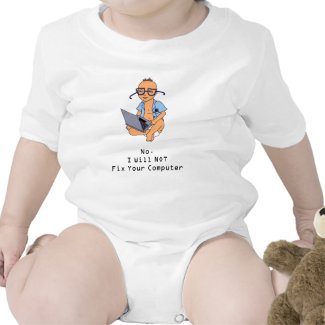
I think this baby is cute. That might seem like a kind of duh thing to say, but when I look at some of my earlier designs, I don't always think the babies are as cute. Case in point . . . the kind of freaky-eyed child in my original Free Gas drawing . . .


I like the way the message fits into the overall design. It's natural to see "Little UU" written across the cup. Sometimes, it's a real struggle to get the text to fit in the size limits - especially if I have a tall drawing. But I feel like the size and placement of the text keeps a nice proportion, and the font is sharp and easy to read. I like my little touch of making the dot over the letter i a darker shade of orange (almost like a little flame).

The body shape of this little person seems just right. A lot of my earlier drawings have babies with bodies that just seem way too long. Maybe I was trying too hard to be realistic while looking at my son as a model (he's taller than more than 97% of kids his age). But this baby looks pleasantly plump and kind of squat - in that cute cartoony baby way.

And did I mention that I like how this is a portrayal of something I care about? :D I'm sure I did, but I want to mention it again. I don't think I've drawn anything that goes against my values (though I have drawn Little Republican designs - I believe that we should be respectful about politics when possible), but I've drawn things that are lacking in personal value for me.

This drawing is an expression of my faith. And it's uniquely mine. There is no other design out there quite like this. How cool is that?

Speaking Out Against GLBT Intolerence with Art

Today is the National Day of Silence to Raise Awareness About, and Fight Against, GLBT Teasing, Bullying and Abuse in Schools. This event has evolved over the years and is organized and carried out by youth and students.

I am not young. I am not a student (officially). And I'm no good at being quiet. In fact, I wrote some Facebook status messages about this, and a friend astutely pointed out that I couldn't even be silent in writing.

I guess this is okay, because non-students and adults are encouraged to participate by signing a pledge to speak up about this issue.

In the past year, I've been expressing myself through the artwork I do for my store, so this is a small gesture, but I've chosen today to be the day that I add a new design supporting GLBT families, and I'll use this blog post as a way to say a bit more about this issue.

The Day of Silence is organized to focus on harassment of GLBT children and youth in schools (not on the rights of GLBT parents to care for their families), so my drawing isn't entirely relevant. However, the passage of Prop 8 in California seems like evidence that far too many Americans are comfortable tolerating, or even championing, bigotry. And bigotry is what is underneath all of this.


In reflecting on my childhood and adolescence, I wasn't really personally hurt by anti-gay teasing or bullying. I remember that I used to hold hands and skip in the hall with another oddball student in highschool and that we were accused of being lesbians. We didn't do that often and I don't remember the teasing being persistent. It is an example of people thinking that calling someone a lesbian is an insult though.

What stands out a lot more in my memory is my summer school session on US History . . . the teacher told us his version of the evolution of the word "fag" as an insult. Brits will tell you that fag is another word for stick (it's used for cigarettes because they look like sticks). According to this teacher, the word fag was associated with gay people, because during the witch trials, people would throw accused homosexuals on the fire with the accused witches - treating them like nothing more than sticks to burn.

I really don't know if there is any truth to what this teacher told us, but I have always remembered it. It's a vivid portrayal of how horrific hatred can become when it goes unchecked. GLBT individuals are human beings. When someone chooses to hurl the word "fag" as an insult, s/he is invoking the kind of hatred and de-humanizing that results in persecution and murder. If we hear other people do that - casually or deliberately - we have a responsibility to speak up right then.

When I was an elementary school teacher, I was careful to firmly say, "Gay (or fag) is not a word to say to hurt someone or insult them" if I heard it used in that way. It was inappropriate for me to elaborate, but I at least took that stand. If you're reading this, please feel supported in taking whatever stand you can.

Sweet Mother's Day Gifts for Less

Little Characters, my online shop, has some new designs in time for Mother's Day. They're cheaper than flowers or fancy perfume, and a whole lot cuter.

You can browse through the Mother's Day Gifts in the Holidays section of Little Characters or click any picture to buy now. These designs feature the words Mom or Mommy written in pink letters filled with red hearts. Simple but unique. In addition to T-shirts, you can also find Mom / Mommy journals, tote bags and even on aprons that can be used for privacy for new, nursing mothers.


Saturday, April 4, 2009

More bad news for house prices

We received this in the mail a little while ago:


Now that can't be good. On the plus side, maybe if enough people visit our Little Characters store we could buy a house! Pity we missed the expiry date for that $10 off, though...

Friday, April 3, 2009

Sometimes it rocks to be a work from home mom!

A few months back, I wrote a journal post called, "Sometimes it sucks to be a work from home mom", so I feel obliged to balance that out today.

I'm feeling very happy about a sale I made today. I only earned $9 for a whole lot of time, but I feel as chirpy as a Disney princess!

Someone ordered a Personalized Passover baby T-shirt. I really enjoy getting the emails with those requests! Sure, when someone emails drawnbyk@gmail.com to ask me to personalize a design or change the coloring, it represents more work for me with no extra pay. But it feels more personal than just seeing sales reports. I get to have a mini written conversation with a person who has found my artwork on the internet and actually decided they want to buy it for a baby or toddler to wear! Pretty cool!

I even find out the first name of the baby, and I can imagine that there is some adorable little person with that name wearing my shirt! This time, I even got to imagine a little more, because the customer asked me to make slight changes in the drawing (making the hair curlier and longer) to make it better resemble the baby. I hope that little girl with the curls is old enough to taste a little sweet charoses, and I hope that when her family gathers with her for the seder, they like her shirt!


The customer who ordered that shirt just sent me this message:

Hi Kerridwen -
Just wanted to let you know I got the shirt today and it's gorgeous :) Thanks so much!


How fantastic is that?!